As a digital agency, we are usually busy helping other businesses shape their identities and found ourselves overlooking our own. This time, we gave ourselves the full client treatment.
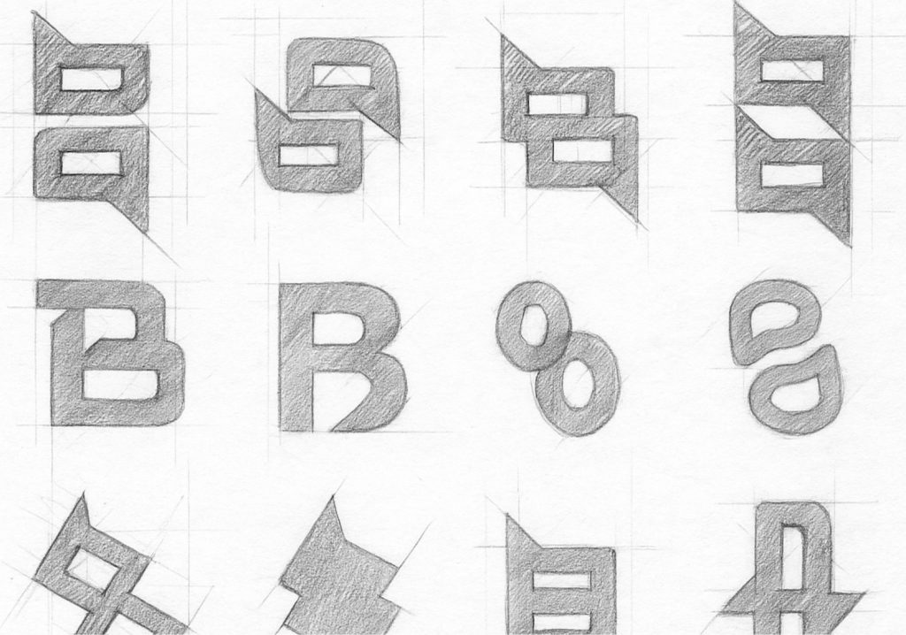
From research and strategy to sketches and refinement, we went through every stage of our branding process to ensure it was authentic, thoughtful, and future-ready.
From client testimonials through to our methodology we kept coming back to a few key qualities that define us:
- Clear, proactive communication
- Fast, reliable support
- Deep technical knowledge
- High standard in everything we do
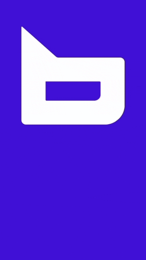
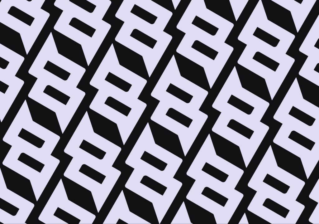
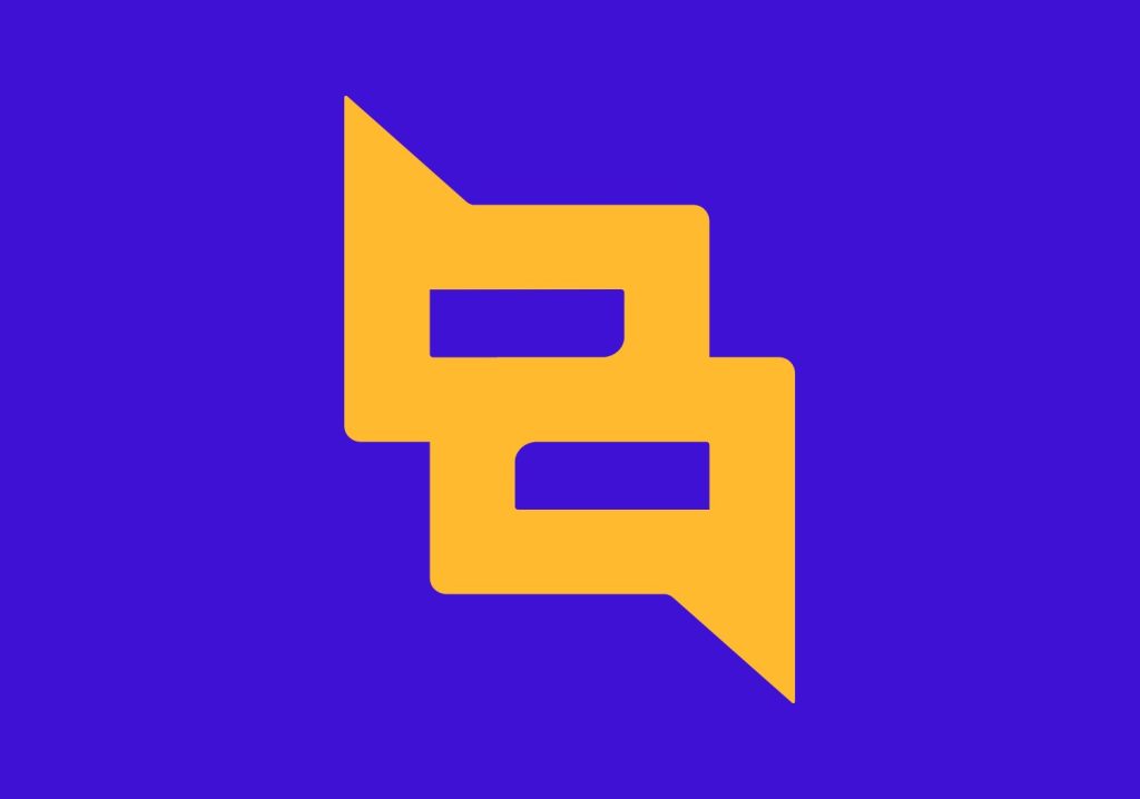
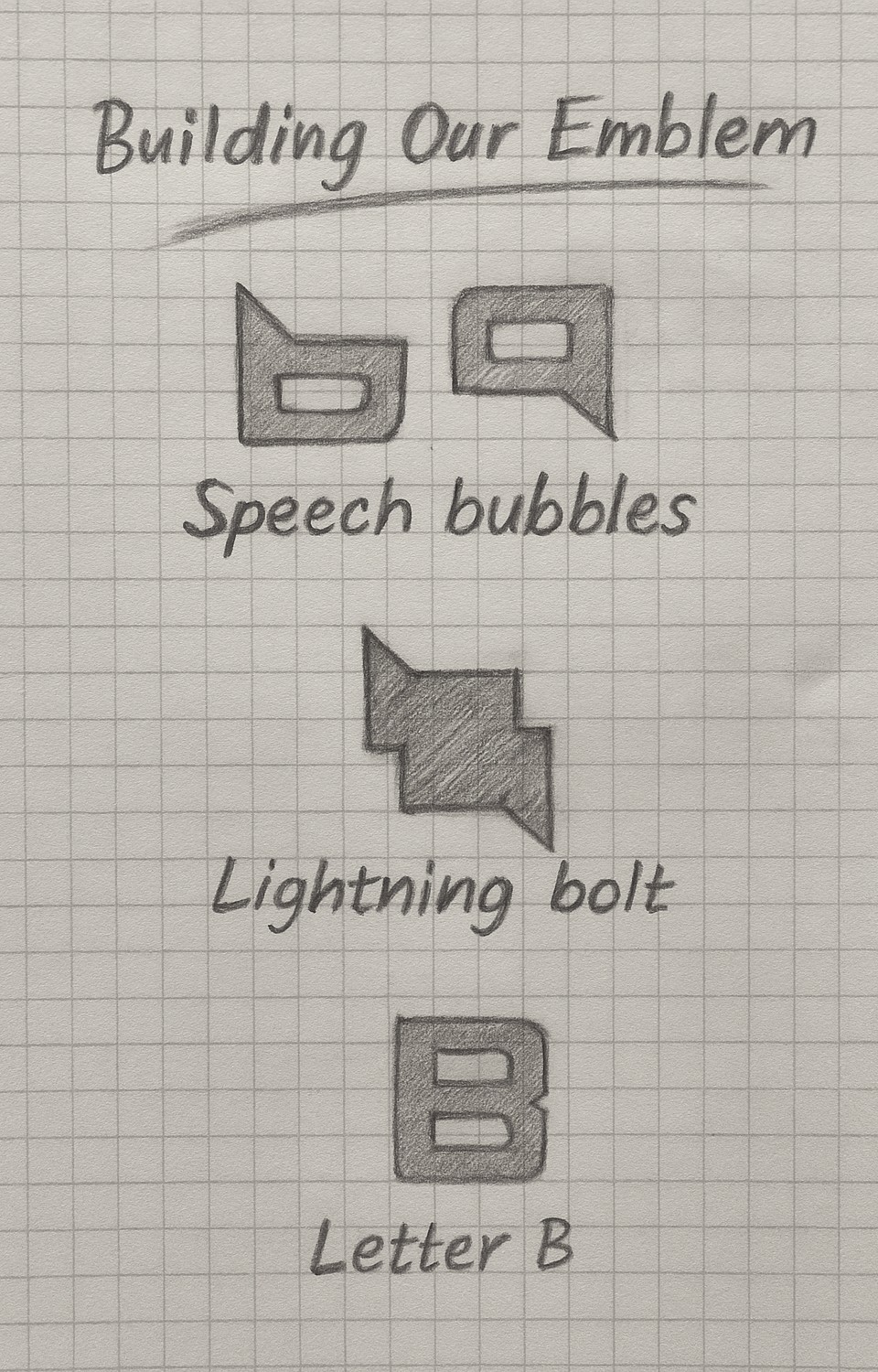
Our brand emblem was created combining speech bubbles, reflecting how communication is at the centre of all we do, with a lightning bolt reflecting our dynamic energy and fast support. We then merged these elements to create a capital B ensuring that our brand is uniquely Blaze.
One of our biggest changes was our colour palette. We wanted something that honoured both our roots in web design and our approachable, collaborative culture. Inspired by the classic hyperlink blue, we softened it to create our own signature “Burple.” After careful testing to meet accessibility standards, we built a versatile palette around it; including dark grey, bright gold, and soft purples to create a brand that’s as practical as it is distinctive.
This journey has been a great reminder of the power of branding. Not just for how other companies see you, but for how you see yourself.
Brand design that reflect your business
We believe the new Blaze Concepts brand better reflects not just the business, but our team as a whole. From gamers to athletes, music nerds to creatives, the new logo shows our dynamic and energetic spirit while retain a friendly feeling.