Modernising a logo while retaining their heritage
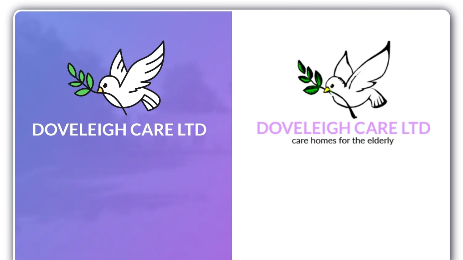
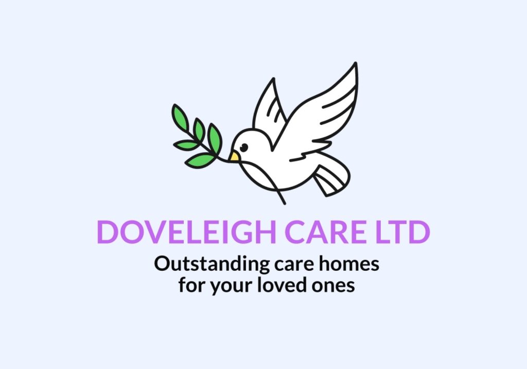
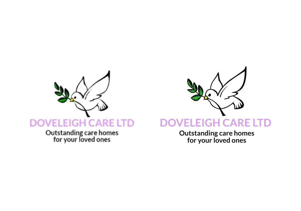
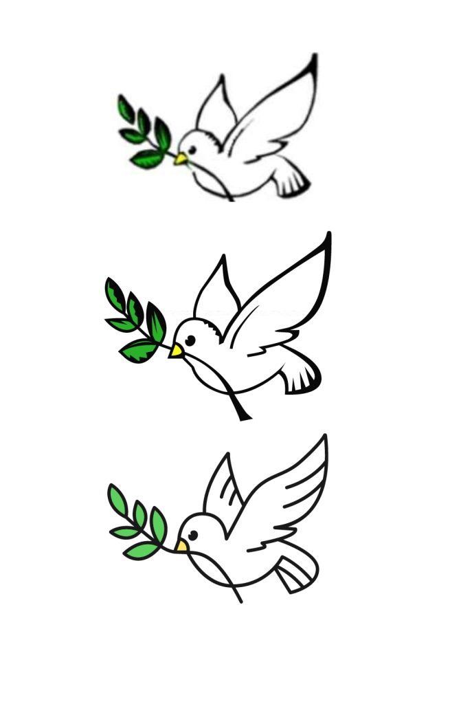
Doveleigh Care Ltd, a long standing client of ours needed a vectorised version of their logo to be used both digitally and in printed materials however they only had a low resolution version which didn’t have the resolution required.
We discussed different solutions we could provide and agreed they first wanted to see a cleaned up and vectorised version of the brand replicated as accurately as possible.
No auto vector here!
While retaining the same colours, we slightly tweaked some of the saturation and hues to give them a fresher and more legible look giving the client greater flexibility.
It could have been tempting to go in a brand new direction, with a sensitive redesign like this it is important to ensure you retain the essence of the heritage brand while bringing it to the next level.
The client can now use this logo across all medias and allow their branding to truly soar.
Time for a rebrand?
Updating your branding can breath fresh air into any business, whether it is just a slight tweak of a full rebrand.
Our creative team also has a wealth of experience in branding, design and print services.
If this is something that you think we can help you with, get in contact today!
