Friendly and welcoming colour palette
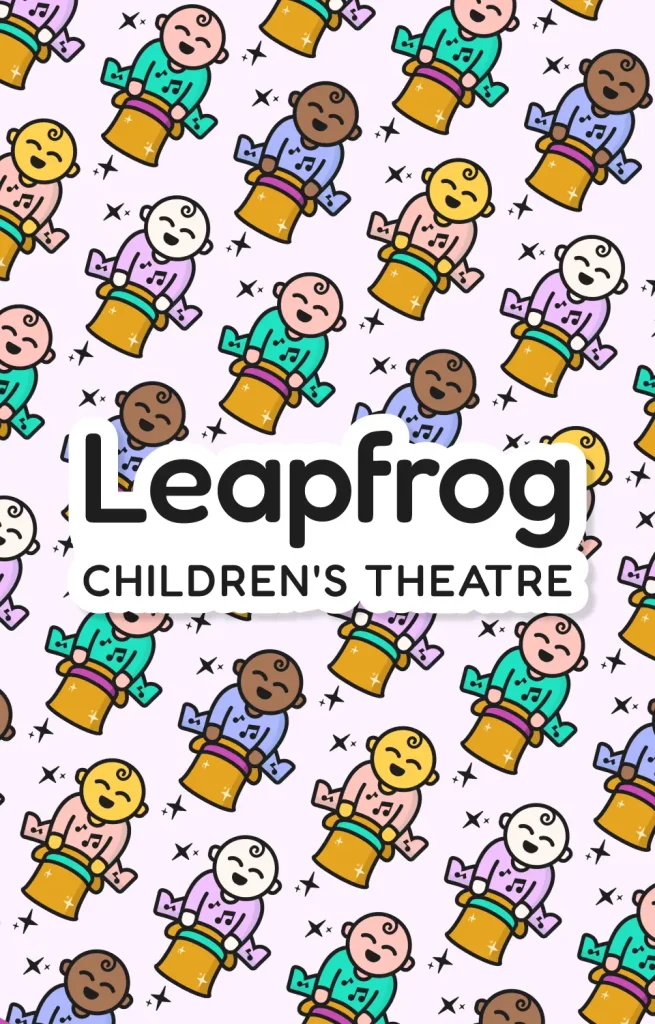
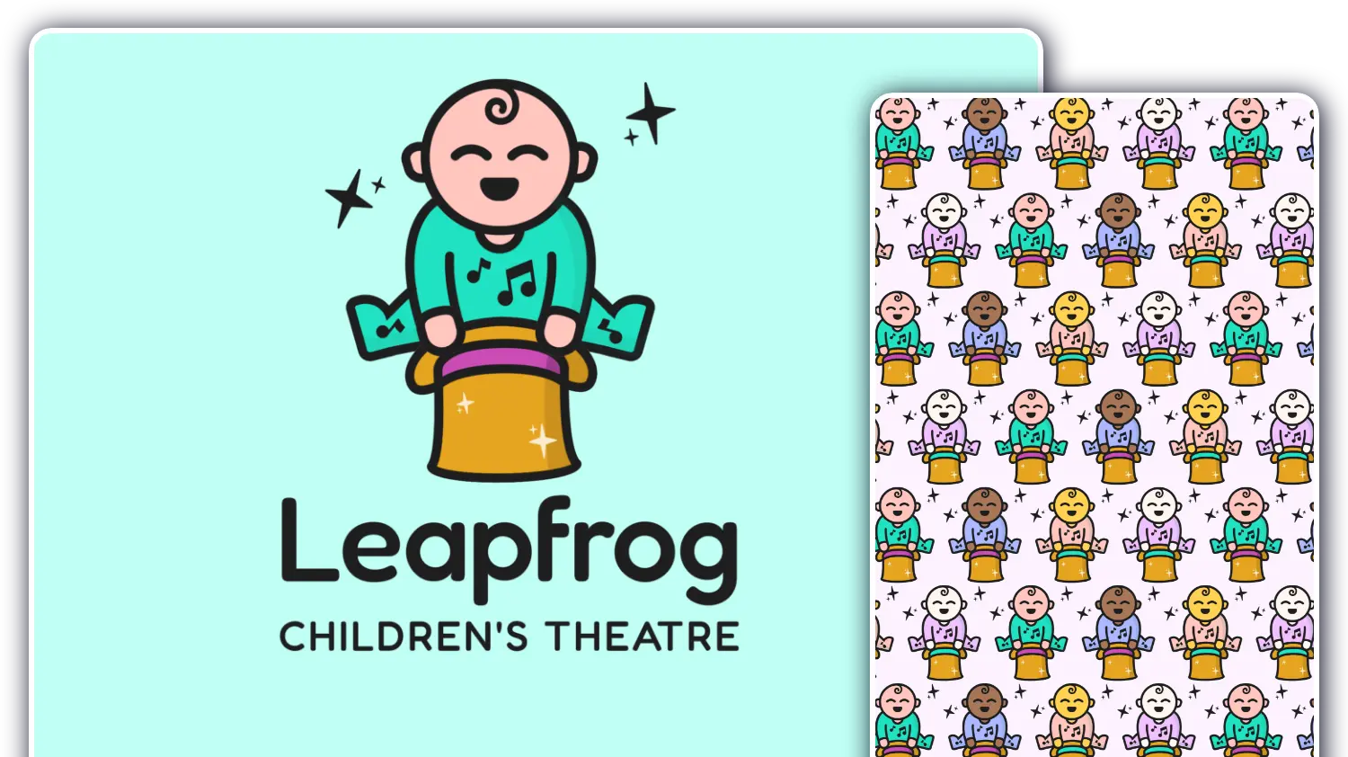
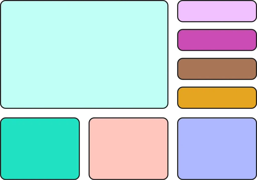
It was important to have a wide range of colours which worked in harmony together ensuring clear and consistent brand identity across all mediums.
With flexibility in the design it allows the use of a range of colours always ensuring that suitable contrast can be found with clear overlaid text.
Without wanting a direct focus on a masculine or feminine colour we built around two shades of pastel green while bringing other “baby friendly” colours into the mix.
Assets to help build out the brand
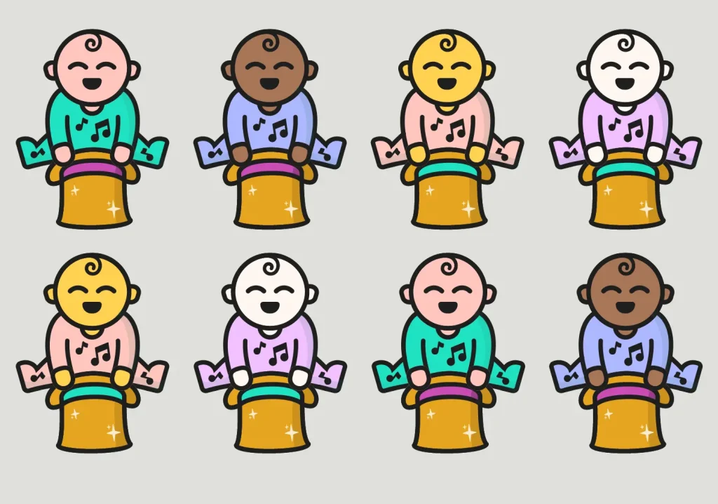
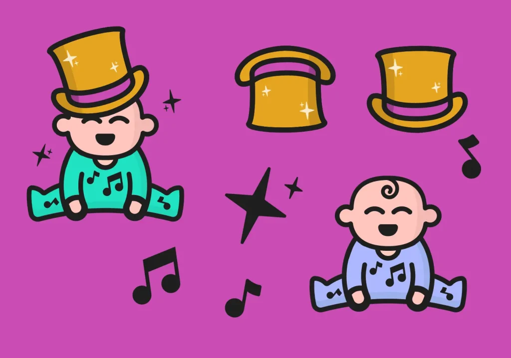
Beyond the logo itself it was important to have extra assets and variations to the design allowing a much stronger brand identity.
With this in mind throughout the whole design process we took a modular approach allowing different elements to work individually to reflect the company. From the top hat to the stars and musical notes, they can all build on each other to clearly resemble the company.
We also produced versions with the hat on the babies head as well as without the hat at all to allow so much more flexibility.
The right branding for your audience
When designing a new brand it is important to focus on your audience and how they will convey and experience this visual representation of the company.
This design is perfect for the target market of families with young children and theatre and stage lovers while this playful style wouldn’t work in different industries, such as for a care home.
Our creative team has a huge range of experience working with companies in all industries providing bespoke designs tailored for each project.
If branding is something that you are considering, we would love to hear from you and bring your vision to life.
