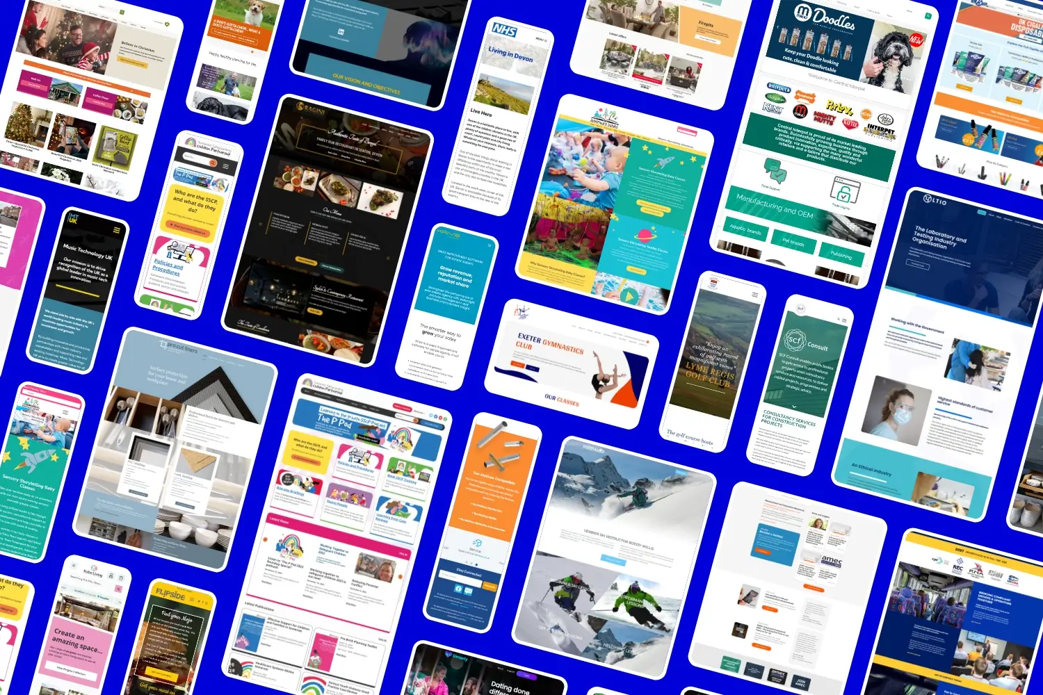
With roughly 60% of all website traffic coming from mobile devices and the rest made up of a wide variation of screen sizes, having a responsive website has never been more important.
As a standard, we build all of our websites following the latest responsive practices ensuring that it performs and is as user-friendly as possible no matter the device.
Since the term “responsive websites” is commonly used, we thought it would be helpful to explain what they are and highlight their benefits.


What is a Responsive Website?
A responsive website uses a flexible and fluid grid layout that adjusts dynamically to the screen size of the device it is being viewed on. A bit like having a liquid filling different shaped containers.
Fundamentally responsive design is all about creating web pages that look good and work well on any device. This approach contrasts with the former method of designing separate versions of a site for different devices, which can be time-consuming and difficult to manage. By using responsive design principles, we create a single cohesive website that provides a consistent experience for the user.
The BENEFITS of BUILDING a Responsive Website
Improved user experience
Users expect websites to load quickly and be easy to navigate, regardless of the device they are using. Responsive websites adjust to the user’s screen size, ensuring that text is readable, images are appropriately sized, and navigation is straightforward. This leads to a greater user experience and can increase the time users spend on the site helping your website hit it’s conversion goals.
SEO benefits
Search engines favour responsive and in 2015, Google introduced a mobile-friendly ranking algorithm, which gives preference to mobile-friendly websites in search results. Responsive websites are inherently mobile-friendly, helping to improve search engine rankings. Additionally, having a single URL for both desktop and mobile versions simplifies SEO efforts, avoiding the need for duplicate content and improving the site’s authority.
Increased reach and engagement
Users are more likely to engage with content that is easily accessible and viewable on their preferred devices. This increased reach can translate into higher engagement rates, more conversions, and ultimately, increased revenue. Having a responsive website allows businesses to reach a broader audience and is key in the current internet landscape.
Future-proofing
The web is continuously evolving, with new devices, screen sizes and ratios being introduced regularly. A responsive website is more adaptable to future changes in technology. Instead of having to redesign or develop new versions, a responsive website site is designed to be flexible and adjust to new screen sizes and resolutions, providing a long-term solution.
Simplified analytics and reporting
Managing multiple versions of a website can complicate analytics and reporting, making it harder to track users behaviour and website traffic. A responsive website simplifies this process by providing a single set of data where tools like Google Analytics can easily track user behaviour across different devices, giving businesses a comprehensive view of how users interact with their site.
Conclusion
A responsive website is a vital component of modern web development. It ensures that websites are accessible, user-friendly, and visually appealing across all devices.
As the digital world continues to evolve, the importance of responsive design will only grow, making it an indispensable strategy for businesses aiming to thrive in the online space.
Get in touch with us today if you require a responsive website